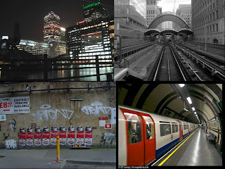
- Prince of Wales RD - A busy, urban area with alot of lighting. Appealing to the target audience by nightclubs and a busy, youth atmosphere as well as the artist first laying eyes on our female character. Lighting also becomes a benefit from the clubs, shops and street lights.
- Back Ally on Prince of Wales RD - Where we see our artist smoking, to make the audience aware that he's the artist, singing along to parts of the song. This could come across as him reminiscing over the girl he just met.

Tuesday, 13 December 2011
**LOCATION INFORMATION**
My music video for Context's song 'Drowning' will be filmed outside, during the night. It's all set on one location as I wanted the track and video to be based on present and future actions. This will make the music video appeal to the target audience by it's mise-en-scene, costumes as well as ways of meeting girls and the affections they show to females or males. The video will look sleek from the lighting. Different colours given off by street lights are warm which makes the narrative seem happy and give off a good feeling. Locations include;
Thursday, 17 November 2011
Analysis of 3 Album Covers From our Chosen Genre.
My chosen genre of music from my music video is Pop Dubstep. We were assigned to write 3 analysis's of chosen album covers from this genre.
1. Chase & Status "No More Idols" (2011).

The album cover from the band Chase and Status "No More Idols" has chosen to use a black and white image of a bulldog with a floressent yellow writing, telling the audience of what band it is and the name of the album. From research of the audience who would listen to this genre of music, a bulldog is populally used as an English/United Kingdom symbol & as well as being a sterotypical dog for my audience to own. I believe that the image of the bulldog is in black and white due to the title of the album. "No More Idols" sounds like that something has no become non-exsistant due to death or the fall of someone/thing important and the way that has been represented from the image is from the use of the black and white. The colour of the font works well with the album cover as yellow is a representitive colour of the music genre as well as standing out very clear against the black and white image. The title and the name of the band have been typed in capital letters which comea across as bold and agressive like the music can be.
2. Nero - Welcome Reality (2011).

The album cover of "Welcome Reality" from the band Nero provides the audience with a futuristic setting, a movie poster layout & an unusual font for the band name. The title of the album "Welcome Reality" is used in making this album cover by the use of the movie poster set out and the design the artists have used. "Welcome Reality" sounds like someone/people are living in a futuristic & unreal world, in which they need to face the reality of their new setting and world. This could also be picked apart for an in-depth meaning which could be someone leading an unreal lifestyle and are living in denial of real things happening around them and they're in need to come back to reality and face the real world around them. The design of the album cover, features mostly of free space of a space like sky, with stars, shooting stars and a galaxy, while the bottom half of the album features a dark blue skyline of the city, rocks, two people, smoke & small writing about the album. This futuristic setting is related to the genre of music they produce, where using computer generated programs is much more futuristic than using an acoustic guitar. The two people heading towards the skyline are meant to represent the band, who are a duo. Not only are the two characters in the center of the album, but the band name is right above them, making the audience aware of who they are. The diamond also in the center of the name title which attracts the audience to the band name as well as seeming like a futuristic doorway to reality. The colour scheme of the cover consists off blue, black, brown & a mild yellow which are colours of modern technology.
3. Calvin Harris - Ready For The Weekend (2008).

Calvin Harris's "Ready For The Weekend" album cover has used a black and white image of a young woman wearing sunglasses and the name and title of album on the left hand side. The black and white image works with the title of the album "Ready For The Weekend" by using a young & glamorous woman who's had her hair and make-up done and wearing novelty sunglasses. This could represent that during the week, her life is black & white and boring and now that she's "Ready For The Weekend" she's waiting for the fun and colour to hit her life, for the "light to shine" from her eyes and to enjoy herself. The font used for the title and name of the artist is a font like a digital clock would use. Not only this is futuristic which represents the kind of music the artist makes, but also could represent the digital clock numbers & time and being ready to go out and enjoy the weekend.
1. Chase & Status "No More Idols" (2011).

The album cover from the band Chase and Status "No More Idols" has chosen to use a black and white image of a bulldog with a floressent yellow writing, telling the audience of what band it is and the name of the album. From research of the audience who would listen to this genre of music, a bulldog is populally used as an English/United Kingdom symbol & as well as being a sterotypical dog for my audience to own. I believe that the image of the bulldog is in black and white due to the title of the album. "No More Idols" sounds like that something has no become non-exsistant due to death or the fall of someone/thing important and the way that has been represented from the image is from the use of the black and white. The colour of the font works well with the album cover as yellow is a representitive colour of the music genre as well as standing out very clear against the black and white image. The title and the name of the band have been typed in capital letters which comea across as bold and agressive like the music can be.
2. Nero - Welcome Reality (2011).
The album cover of "Welcome Reality" from the band Nero provides the audience with a futuristic setting, a movie poster layout & an unusual font for the band name. The title of the album "Welcome Reality" is used in making this album cover by the use of the movie poster set out and the design the artists have used. "Welcome Reality" sounds like someone/people are living in a futuristic & unreal world, in which they need to face the reality of their new setting and world. This could also be picked apart for an in-depth meaning which could be someone leading an unreal lifestyle and are living in denial of real things happening around them and they're in need to come back to reality and face the real world around them. The design of the album cover, features mostly of free space of a space like sky, with stars, shooting stars and a galaxy, while the bottom half of the album features a dark blue skyline of the city, rocks, two people, smoke & small writing about the album. This futuristic setting is related to the genre of music they produce, where using computer generated programs is much more futuristic than using an acoustic guitar. The two people heading towards the skyline are meant to represent the band, who are a duo. Not only are the two characters in the center of the album, but the band name is right above them, making the audience aware of who they are. The diamond also in the center of the name title which attracts the audience to the band name as well as seeming like a futuristic doorway to reality. The colour scheme of the cover consists off blue, black, brown & a mild yellow which are colours of modern technology.
3. Calvin Harris - Ready For The Weekend (2008).

Calvin Harris's "Ready For The Weekend" album cover has used a black and white image of a young woman wearing sunglasses and the name and title of album on the left hand side. The black and white image works with the title of the album "Ready For The Weekend" by using a young & glamorous woman who's had her hair and make-up done and wearing novelty sunglasses. This could represent that during the week, her life is black & white and boring and now that she's "Ready For The Weekend" she's waiting for the fun and colour to hit her life, for the "light to shine" from her eyes and to enjoy herself. The font used for the title and name of the artist is a font like a digital clock would use. Not only this is futuristic which represents the kind of music the artist makes, but also could represent the digital clock numbers & time and being ready to go out and enjoy the weekend.
Monday, 3 October 2011
**FIND YOUR TRIBE UK - MY TRIBE AND TARGET AUDIENCES TRIBE**
Apperently, I am... INDIE SCENESTER
You are an Indie Scenester! You are at the forefront on the indie scene – you know all the major players. You’re always ahead of the game – moving on to the next thing once everyone joins in. You like to look good and your icons go beyond the centrefold of the NME – your current look is James Dean meets Grace Jones. Just wait – everyone will be wearing it in a year’s time.
For my target Audience, I did the test again as the people they could be.
Apperently, My target Audience fit into the tribe of... CLUBBER
You are a Clubber! You live for the weekend when you can get on with the real living – going out for 48 hours and dancing the night away. You’re only young once, right? You will go miles to find that elusive perfect rave – if it’s a field in a middle of nowhere, miles from home, or your spiritual home: Ibiza. For you, Space really is the place.
Sunday, 25 September 2011
Q: What are the connotations, meanings & target audience of The Noroflk Spectacular festival?

From the homepage of The Nofolk Spectacular 2011, as an audience we are able to find out what kind of festival it is, what it's target audience is & the meanings behind images and fonts used to create the homepage.
The background of the homepage uses 2 strong & contrasting images of grass and metal flooring. They've used this to put across to the audience that Norfolk Spectacular is based on a park or showground where the audience will be held, while the metal flooring represents the modern stage that will be used by the peformers. Also, the colour of the metal flooring looks modern and 'hip'. An obvious edit used on this homepage is the ripped effect that seperartes the two images, this gives it a modern feel. Against the metal background, the audience is able to view some of the acts peforming on the stage over the two days. They're against the metal as they're the peformers who will be on the stage at the festival. The fonts used are of the same as the artists logo's. This helps the audience reconise which artist's are playing as well as attracting other audiences into coming to the festival. The iconography used for Norfolk Spectacular logo stands out from the page due to it looking alot more 'grungy' than pop and mainstream. The font used looks almost like tattoo writing and the icon's of speakers and volume controls behind the logo could suggest that it's trying to reach out to a wider audience. The layout also uses the rules of third by keeping all of the information right in the middle of the page, instead of all over. This could just suggest the audience to be drawn into the middle of the page, making it simple to read all at once instead of all over the page, where people might get lost and confused with the information given.
I think this music festival would appeal to audiences between the ages of 14 - 30. I believe that this music festival ranges with audiences, due to how mainstream these artists are as well as the radio station supporting this festival is (KISS FM). The younger generation would be drawn into the page, by the use of the logo's of the artists as well as the range and style of the layout. The older side of the audience would be attracted by the modern look it gives, as well as the festival being supported by 'Kiss FM' (top left) which means that the audience who listen to this, would be very interested into coming to this festival.
Sunday, 11 September 2011
**CONTEXT MC - DROWNING LYRICS**
Verse 1:
That day I’d have never know,
Listening to Mistajam rips in my headphones,
That you’d walk by, one of heaven’s own,
Erasing what’s before to run my life like Treadstone,
I don’t know if it was the song by the Weekend
Or the nutty bomb of MD
But her eyes had me feeling this way
Gripped I couldn’t look away
Chorus:
So I went and took a look into them,
and then I saw now
So I went and took a look into them,
I’m drowning now
- Trapped elated and hooked, breath had been took
Looking into them and I’m drowning now
- Coz I was captivated and hooked,
- Couldn’t help but just lose myself in one look
Could it really be this? Really be that I’m drowning now
Verse 2:
In one look I knew
That I could be the bloke to ring you when he’s out and misses you
Or ring your finger up and “Mrs” you
And this can be the first sight track she reminisces to
I dont know if it was the tunage by The XX
Or the text from my ex ending in an ‘XX’
But her eyes had me feeling this way
Gripped I couldn’t look away
Chorus x 3
Thursday, 8 September 2011
**MUSIC VIDEO TREATMENT FOR CONTEXT - 'DROWNING'**
I imagined this music video to have an emotional effect on the audience as well as showing it through the character's eyes. The song is about the artists falling for a female just by looking into her eyes, a lusting moment.
I'm imagining the music video to have slow cuts due to the track being quite slow and calm. This could have a great effect because of the subject of the track and of the artist's way he's feeling. People often describe when they first 'lust' for someone has time almost standing still, not aware of your surroundings and just focusing yourself on this one person and I want these feelings to be put across in the music video. I'm also not wishing for the artists to sing into the camera like most artists of Context's genre do. Again, this is because I want to the artist to feel the emotions of lust and not being aware of people around him and just the female involved. Alot of close up's shall be used, of faces, eyes, hands and lips to show what the characters are doing as well as showing the emotion of lust and love. Establishing/wide shots shall be used to make the audience aware of the place they're in which will focus on target audience's urban landscapes. I'd also like this to be filmed at night, with most lighting coming from street lights, nightclubs, shops and cars. I feel like this would be appropriate as I can imagine the track to be better suited this way.
The track will be started off with an establishing shot of 3 out of the 4 characters walking down a street with the artist standing in the middle of the group. When the music gets close to the chorus, the 4th character (female) walks past the group with eye contact (POV shot) and then we witness the artist approaching the female character and then show signs of affection. alot of close up shots of his hands, face, eyes, lips and she accepts. Almost seems like a dream. He doesn't sing along to the song until we get a close up of them both, forehead on each other, looking into each others eyes to say "I'm drowning now". The second verse continues when she walks away and he follows behind. He ignores his friends, leaving them behind, she looks over her shoulder and smiles. Liking the attention. He ignores everything and everyone round him, dropping a CD of a band, which the song mentions and texts we see he fails to reply to. Chorus comes in again, with her still looking over her shoulder, turning around to smile, cuts back to the artists to say "I'm drowning now". As the song finishes we cut back to them both very close, kissing. extreme close ups of the artists lips saying "I'm drowning now".
I aim my target audience for this track for the ages between 16 - 30. The genre of the music (drum & bass/ pop) may appeal to an audience younger than 16, but they may have trouble in understanding the ways in which the male character acts towards the female. As the genre of music is very modern and new, it may not appeal to an elder generation, meaning they won't watch the music video. Between the ages of 16 - 30, we understand how easy it can be to act on lust to someone and understand the ways in people can react from it.
Thursday, 25 August 2011
Music Video Research **Change of Song**
Since the change of chosen track, I didn't need to worry too much about starting from scratch. But I've decided to do some extra music video research that could influence my new track. It may be the same genre of music from my last track, but the song is more uplifting, heavier bass & alot more variety with singers and lyrics.
1. Nero - 'Promises' (2011)
This track is very similar to my new track, "One More Star" in the ways of featuring a girl singer and the emphasis on the chorus. This track uses it's technology and futuristic feel to make an unusual and space themed music video. The lyrics of the song so go with the visual video, but the audience may need to watch it more than once to really understand it. At the start of the video, we have a small section that last's for 30 seconds which a man and a woman talking, this leads to the audience questioning
2. Chase & Status ft. Delilah - 'Time' (2011)
This video differs to the last music video as this video has more of a narrative. The band do not feature in this video like the last video either, but the singer of the track does. Even though the track is very lively and uplifting, the video makes it come across as a sad and emotional song, expressed though the chosen genre, drum & bass. As the video is based on violence, the audience could say that the speed and loudness of the track could be related to why the director chose the topic of violence for the video.
3. Pendulum - 'Crush' (2009)
This track isn't similar to my chosen track by Olly B, but I like the storyline of this video and would be a influence in my own. It uses flashbacks, merged into the present of the video to show what life was like and how it is now. The use of different colour lighting shows which was past and which is present, makes the audience aware of the switch over. Red to show present (relating to anger) and white for past (dream & memory like).
4. Sunrise Inc - 'Still The Same' (2011)
As my chosen track is about a loss of a loved one, I thought about using the girl singer as a 'ghost' in my music video. From Sunrise Inc's 'Still The Same' video, it uses a faded and brightness edits to show the difference of being alive to being dead or non-existent. This will help me with the editing I could use in my own video to give it a dreamy and surreal look.
**CHOSEN SONG - LOUIS LA ROCHE - MY TURN**
For my music video, I've chosen French House producer, Louis La Roche and his track "My Turn".
Monday, 11 July 2011
Moodboard for Music Video.
Planning our music video's is one of the most important proof's of evidence and helps create ideas and visuals for us to look back on while we make a storyboard for it. We need to make sure that our music track fits with our music video using stereotypes and alot of research.
 When researching music video's that have the same genre as my track, I noticed that alot of these music video's use Urban Landscapes. The popular places for the video's I've seen for filmed in East London, Canary Wharf, train stations, modern block flats & walls with street art on them.
 It is popular for stereotypical props to be used in music video's with a drum & bass genre. These props are dancing, BMX'ing & guns. Most Drum & Bass music video's that I've researched, work with a young generation and gang culture for their narrative. They believe that it spreads awareness for young children/adults to not go into a future of gang crime. Also, prom the pictures above, we notice the costumes are the same, using again sterotyped fashion of hoodies, tracksuits & trainers.
 The narratives of some of the music video's I researched use our British Gang Culture to put a message forward. These narratives can be about anything where violence is used. Hanging around the streets during the day and night in a large 'gang' intimidates any passers by who do not want to get in their way, therefore becoming common pests. Using gang's in my music video will work well with my chosen music track as well as the stereotypical visuals of British gangs.
 Another popular choice of a mise-en-scene is to use Council Estates. Working with Urban Landscapes again. it's an easy and cheap way to shoot a music video. Again, it fits a stereotypical gang 'hang out' as well as providing alot of space for violence, fights and riots. It also has a colour scheme of grimy and de-saturated making it look dull and run down. If to be filmed at night, the flat lights would be on which would make it a very effective source of light id wanting to film at night.


Friday, 8 July 2011
Researching Influencing Music Video's.
Since choosing my music track "You're The Enemy" by Mirrored Theory, the next step is to research ideas that could help influence me into the filming. My first step into my research is to look at music video's which have the same genre of music to mine to see what kind of idea's and narrative story lines they include. My music track's genre is Drum & Bass, so I shall be researching British music producers and music video directors that focus on this genre.
Example - Watch The Sun Come Up (Devil's Gun Zeitgeist Remix)
Director - Ben Newman (2009)
This music video provides the audience with an Urban Mise-en-Scene, which is popular for Drum & Bass music videos. There are many landscape shots, shot using wide angle, panning & tracking. There are 3 main characters with 2 not coming in until half way through the video. The costumes used in the video, fit the stereotypical people who would listen to this music and would work very effectively in my own music video. Dancing is also a huge part of the music video and works well in this, with the main character dancing to the beat of the music.
DJ Fresh - Louder
Director - Ben Newman (2011)
Another music video that was directed by British Music Video Director, Ben Newman. This has a very different mise-en-scene, but works very effectively with the flamboyance that this video provides for the audience. It has a non conventional storyline, but as the music track is related to Drum & Bass, it's storyline features sports & hobbies of the stereotype's of the people who would listen to this music. It's an up-beat track which helps emphasizes the energy the characters are putting into the skating, biking & blading.
Chase & Status ft. Plan B - End Credits
Director - Kim Gehrig (2009)
This is a very dark music video which tries and represents British gang culture. We come back to Urban Landscapes of subways, undergrounds, streets & buildings with most of the footage filmed in the dark. This could be a problem for me if I cannot get my hands on the correct lighting equipment. The Film Harry Brown features in this as well as the actor Michael Cane which helps promote the music video as well as using the storyline of the film to create this music video.
Magnetic Man ft. John Legend - Getting Nowhere
Director - Diamond Dogs (2011)
This is my favorite music video of the 4 and would be one I would get a huge influence off. It's another music video filmed during the night but light that is shown has been edited to make it brighter. If the audience hasn't researched into the music video itself, they would assume that this music video would be non-conventional, but when I researched into the video, I found out it has a HUGE meaning, using British gang cultures on bikes and representing them as the 'BMX riders of the Apocalypse'. The narrative creates an enigma code which I would like to make in my video.
Monday, 27 June 2011
Write up of 3 Music Video's
As homework set by Mr Seal, we were asked to choose 3 Music Video's of our choice and to write a paragraph about it, using media context.
1. The Streets - Everything is Borrowed.
http://www.youtube.com/watch?v=j8BHL5SWX0Q
 The Video for 'Everything is Borrowed' by The Streets uses a strong narrative structure through out the music video. It also uses Tzetvan Todorov's Theory of the story having a beginning, middle and end. The video starts off with a medium shot of a woman sleeping in bed, then a panning shot to the right, where we see the singer sitting down on a sofa. The room is dark and the only ambient light we see, is on the singers face from the window from the separation from the curtains. The equilibrium is quickly disrupted as he gets up, with the camera following him and him look tense. The jump cut to a man in the mirror in a car and him looking at his friend's watch shows the second party of characters, looking 'hard' and manly suggests that they're the antagonists of the music video. Though out the video me jump cut between both parties of characters which builds up to the disequilibrium which emphasizes on the antagonist party, demanding the singer to 'open the door'. From this point, we see alot of close up shots from the characters which shows the emotion of what's happening and how the Protagonist party is feeling. The disruption is shown using fast tracking shots as well as shallow focus on the Protagonist party to show the audience that they've lost control of the situation. The last scene is of the singer, singing the last chorus and using a tracking shot to back away from the character which develops into a master shot of both parties and the street showing what's going on and happening in that scene.
2. HURTS - Blood, Tears & Gold
http://www.youtube.com/watch?v=JBOEsQCdqpI
 HURTS 'Blood, Tears & Gold' music video begins with a scene of a young ladies leg and as the music starts, lap-dissolve editing is used in time with the music, showing her washing her leg which creates an Enigma code. Through out the video, we see the leg getting shaved, washed again, stocking put on and a white long buckled shoe being put on, meaning the Enigma Code remains through out the video. Towards the end of the video, flashbacks of the leg from the start of the video are shown, with edited in shakes to create an uneasy tension. The whole video has been edited to Black and White which illustrates the depression of the song & lyrics. Through out the video, we jump cut to and from the leg and a band performance. They're put against a black screen and use non-ambient lighting to create a dark and unhappy feel. This relates to how the band is feeling as well as showing the darkness of the song itself. In the middle and towards the end of the music video, we have 2 scenes of a woman crying using a close up shot of her face so we're able to see all emotion on her face.
3. Elliot Minor - Time After Time
http://www.youtube.com/watch?v=n7AonYu2whA

1. The Streets - Everything is Borrowed.
http://www.youtube.com/watch?v=j8BHL5SWX0Q

2. HURTS - Blood, Tears & Gold
http://www.youtube.com/watch?v=JBOEsQCdqpI

3. Elliot Minor - Time After Time
http://www.youtube.com/watch?v=n7AonYu2whA

Elliot Minor's 'Time After Time' music video, uses both band performance and a repetitive narrative structure. The story is based of the lyrics from the Chorus, making this a conventional music video. The footage showing the repetitive story-line is shown 3 times in total, with the second and third time showing realizations and the lead singer changing his actions to win over the girl in the video. Though out the video, the story is cut to a band performance where they're in a dark room and the use of ambient light is used to focus on the band. The dark room and bright light also shows the audience that they're stuck in a dark place or a physiological depression and wanting to break out of it (the light representing that).
Tuesday, 21 June 2011
3 Music Video's from Music Video Jam's 'Top 100 Music Video's of 2010'
As a piece of homework set my Mr Seal, we had to watch some music video's from the site Music Video Jam and write up on any 3 that we liked and why.
1. HEALTH - 'We Are Water' (#95)

I've already watched this video before as I'm a fan of the band. The Narrative of the music video is of the Lead Singer (if you knew of the band when you watched it) dressed up as a girl and running from a man with a sword. The music video lasts for 3mins 28secs, and for 1min 40secs we are witnessing him/her running away from the man. Most of the shots are wide angle so we're able to see both of the characters running with the gap between them. We have close up shots of the feet running from the start and of the face of both characters to see the expression in their faces from the situation they're in. After 1min 40secs, the victim falls to the ground and the attacker and chaser catches up with her/him and we witness the victim feeling helpless, attacking and killing him with alot of gore and blood. Editing included slow motion as well as dimming of the lighting (lighting is non-ambiant through out the whole music video). I like this music video
2. Gemini Club - 'Future Tidings' (#37)

I decided to write about this music video when I was attracted to the title of the track 'Future Tidings'. The characters featured in the music video are of a male and female. The title of the track works very well with the music video because of the heavy green screen editing work used in this. The characters used in this also try and create a futuristic feel by the male character dancing like a robot and the female is lying on the floor while moving her hands and arms about and edited in lines and triangles follow them about. The heavy editing used int this video creates a huge impact and is important for the message of the video for the title of the track. All lighting in this video is non-ambiant.
3. Hey Champ - 'Neveret' (#35)

Yet again, this music video has a futuristic style through out the whole video, but unlike the previous video, the unsual narrative structure of it leaves the audience to be confused. From the first time you watch it, you can see no real obvious meaning from it. The band feature in this video, dressed up in bright/white colours against the dark screen which makes them stand out and watch them peform with alot of wide shots to feature the whole band in as well as panning shots used to almost 'zoom' into the dark character on the chair (above). I like this music video as the idea's for it are a little bit strange but leaves the audience to remember the music video after as well as the track title and song.
Monday, 13 June 2011
Subscribe to:
Comments (Atom)